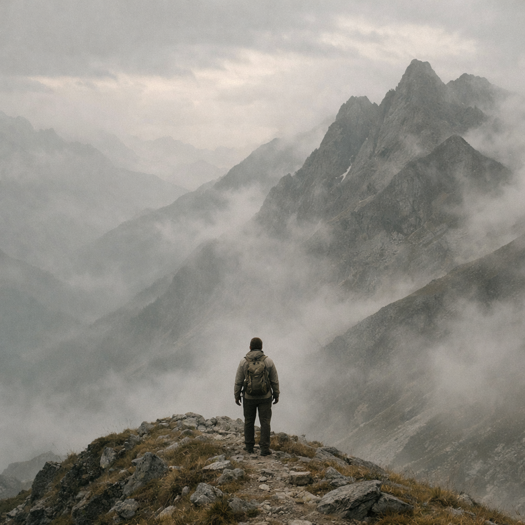
Built on the edge.
Sureridge is an outdoor luxury brand shaped by terrain, weather, and time.
Inspired by ridgelines and long paths, it values restraint, precision, and material honesty.
-
Descritiv Brand Identity
Visual System
Editorial Posters
Brand Guidelines -
Adobe Ilustrator, Adobe Photoshop, Adobe InDesign
Grid-based editorial construction
Visual territory exploration. -
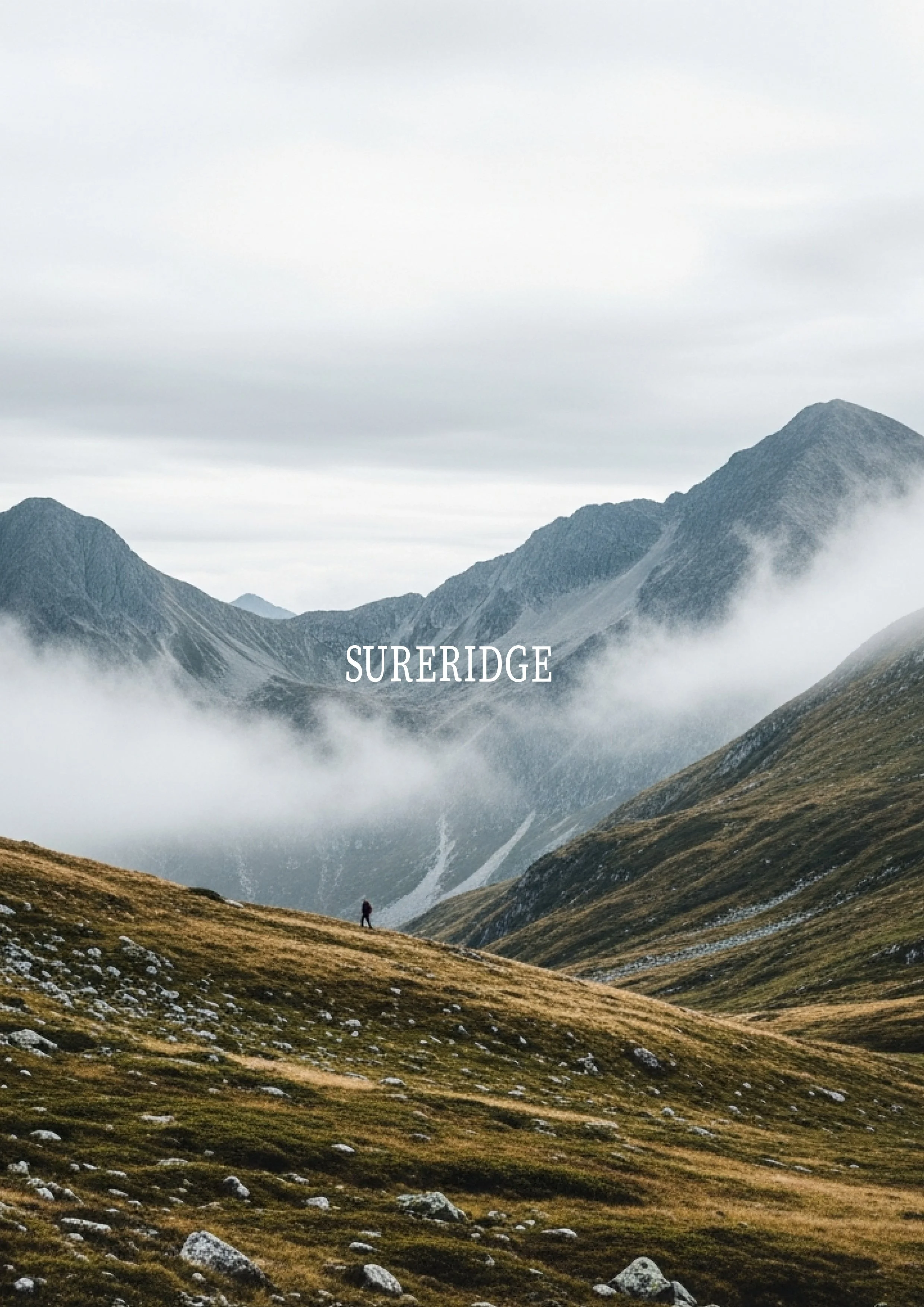
A visual system built to express endurance, restraint, and permanence across every touchpoint.
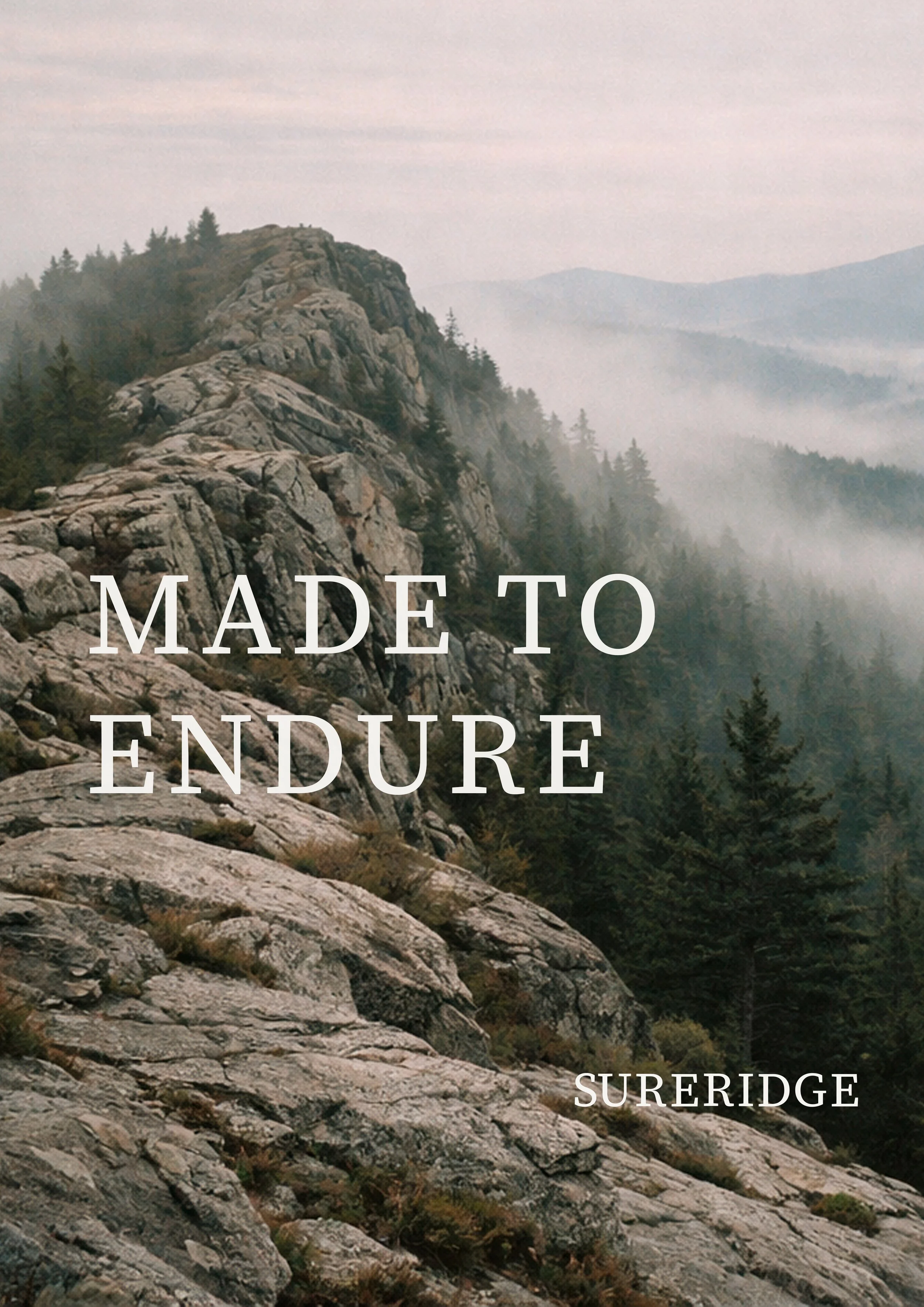
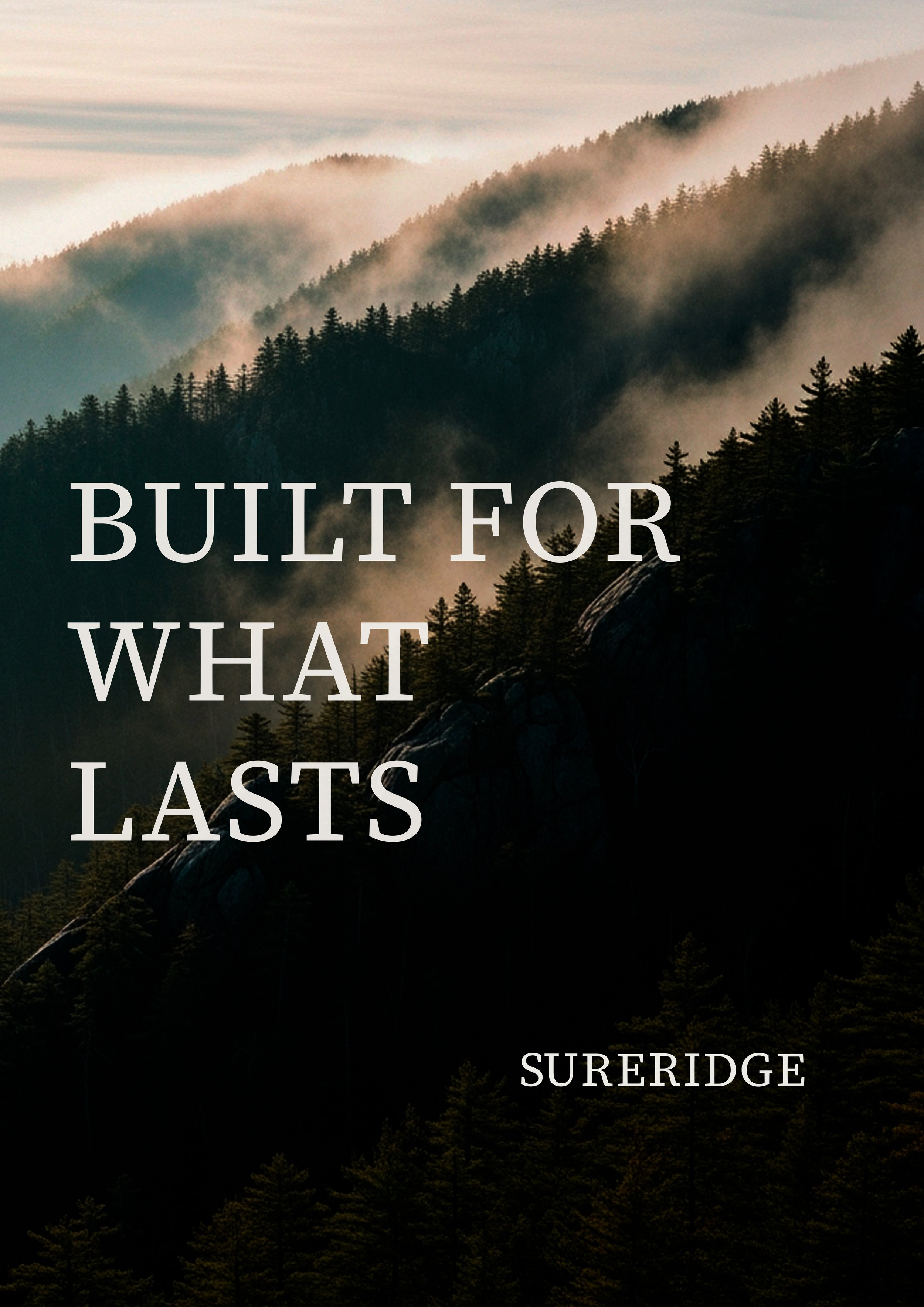
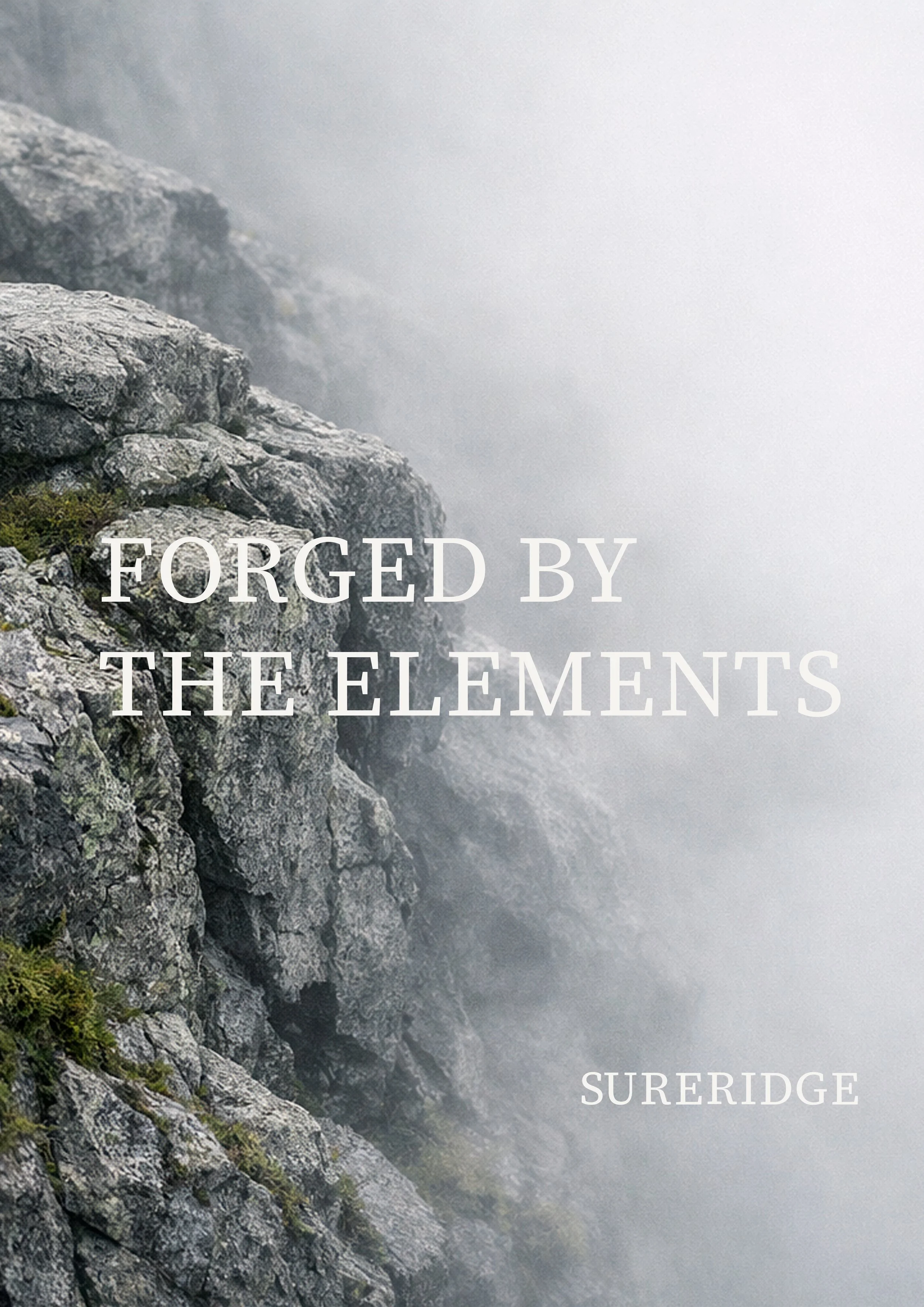
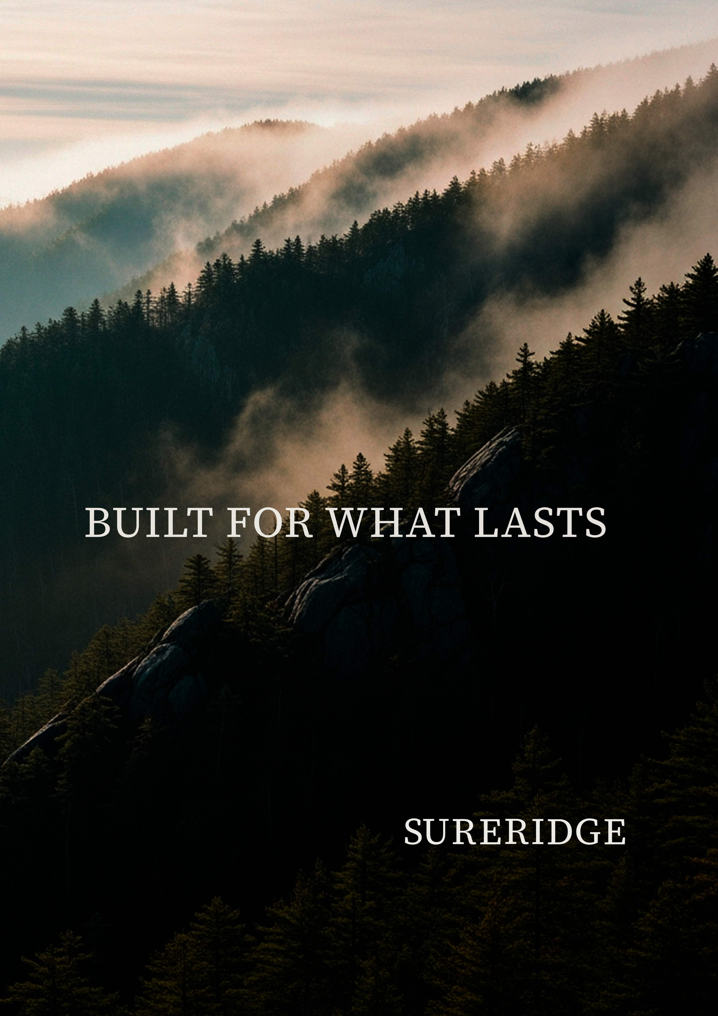
The visual system was built to express restraint, durability and precision.
Every element was designed to reflect material honesty and outdoor permanence.
Sureridge is not just a brand. It is a system of restraint, durability and intention.
Every visual decision was guided by material honesty, outdoor permanence and editorial precision.
From symbol construction to poster applications, the identity was designed to endure quietly, consistently, and with purpose.
This project demonstrates how a clear visual system can translate values into form, and form into presence